Category: Ontario

  • Rose Coloured Glasses

    > > >

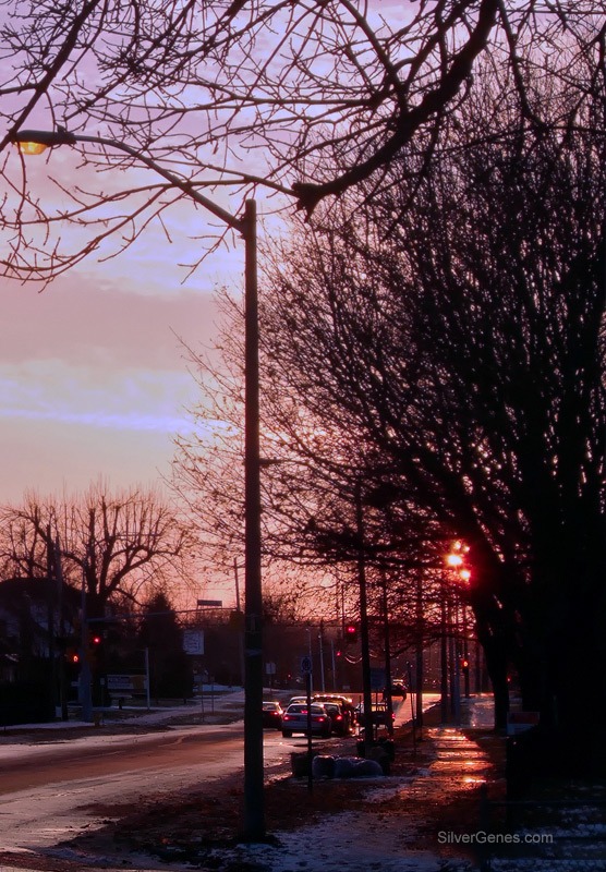
    Winter Light

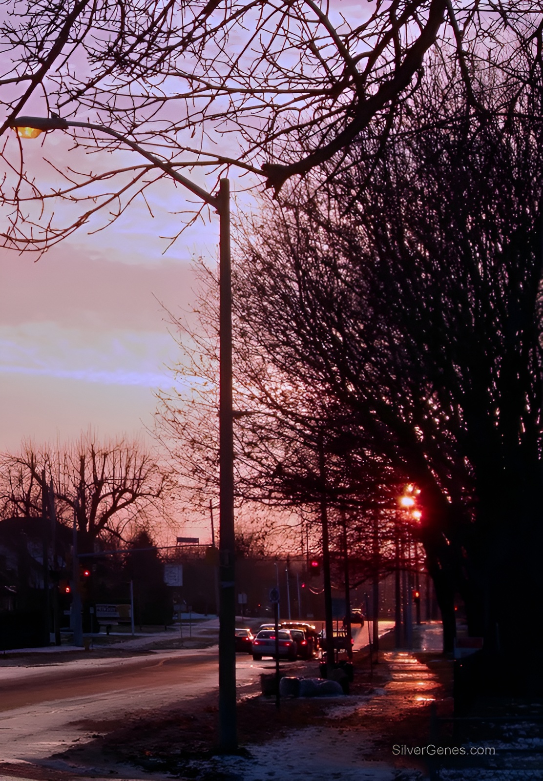
    Ontario evening sky colours are different from the dazzling displays on the prairies. If colour were music, we would be talking Brahms and Beethoven respectively.

    The Ontario colours are softer with shades of pink that blend subtly with the orange sherbet colours closer to the sun. This photo was taken in high quality JPG format on the way to the convenience store with the Fuji F10, a little point-and-shoot that continues to amaze me with the way it handles low light.

    In Photoshop, it was opened in the ProPhoto RGB colour space in order to avoid clipping the warmer colours and adjusted in Curves. This is my favorite colour space for processing everything, especially photos with yellows, reds, and oranges. These are the first colours to be clipped in smaller spaces. Then it was cropped with perspective to straighten the streetlight and horizon. Sharpening was done lightly with the High Pass filter.  Image was converted for web colour space and resized. It’s not a spectacular shot but rather an everyday memory. It captures a brief moment when the world was filtered through a rose-colored sunset.

    Writer’s note: Have you noticed that it is the warmer color that tends to be clipped in images? The same holds true for words. We often tend to censor our passion, allowing some to leak on to the page, but not in its true state. Explore both the vibrant western sky and the rose and orange sherbet sunsets of the central east. Each has value. Each describes a state of being that is breathtaking and neither deserves clipping.
    Fujifilm Finepix F10
  • Outdoor Deep Shade

    > > >

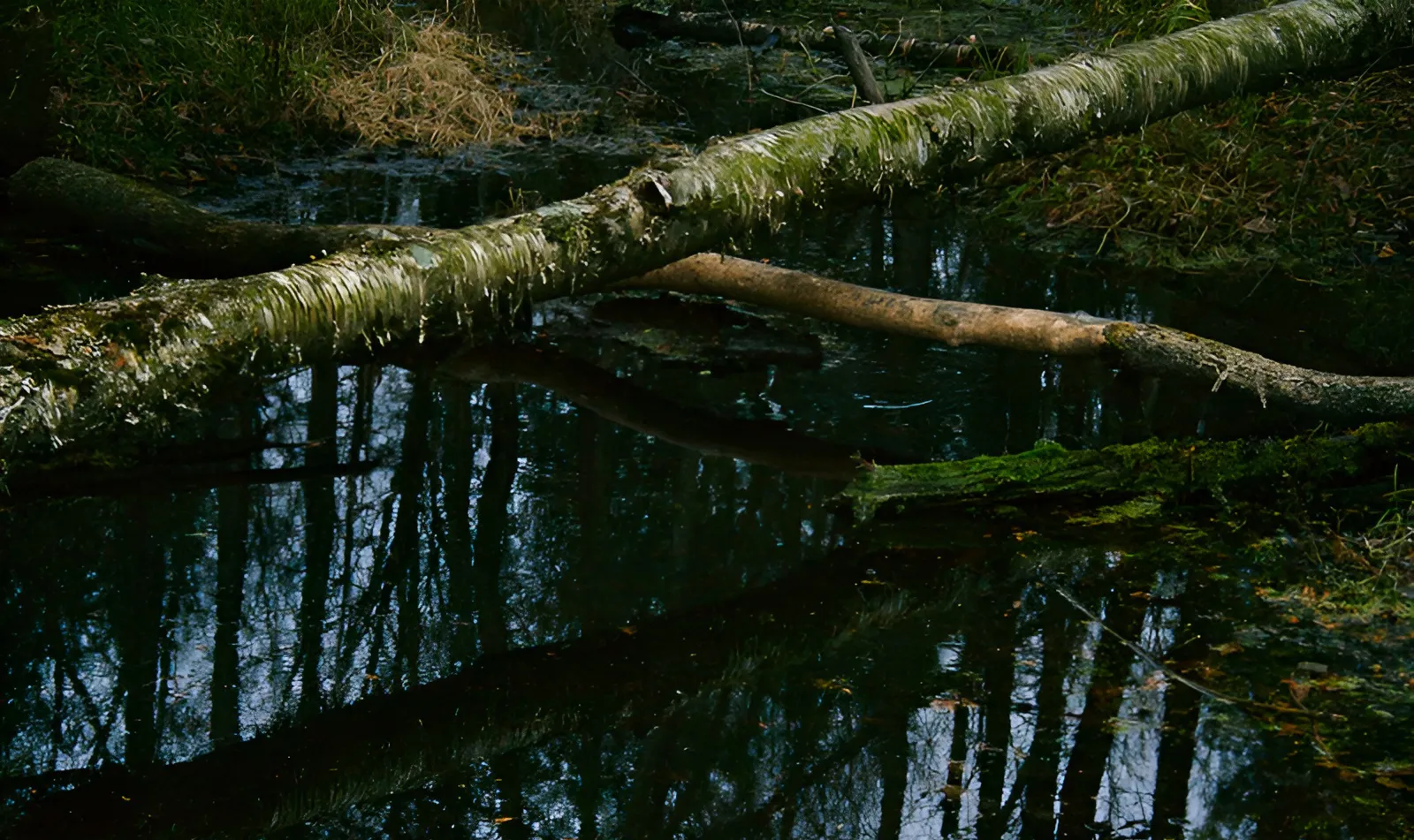
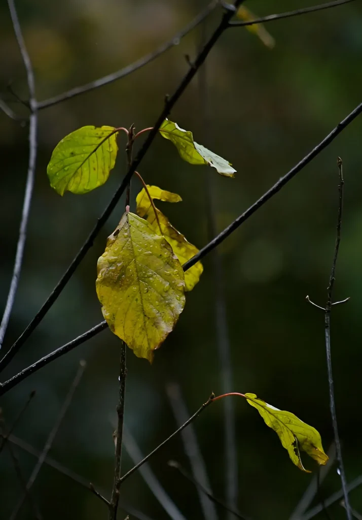
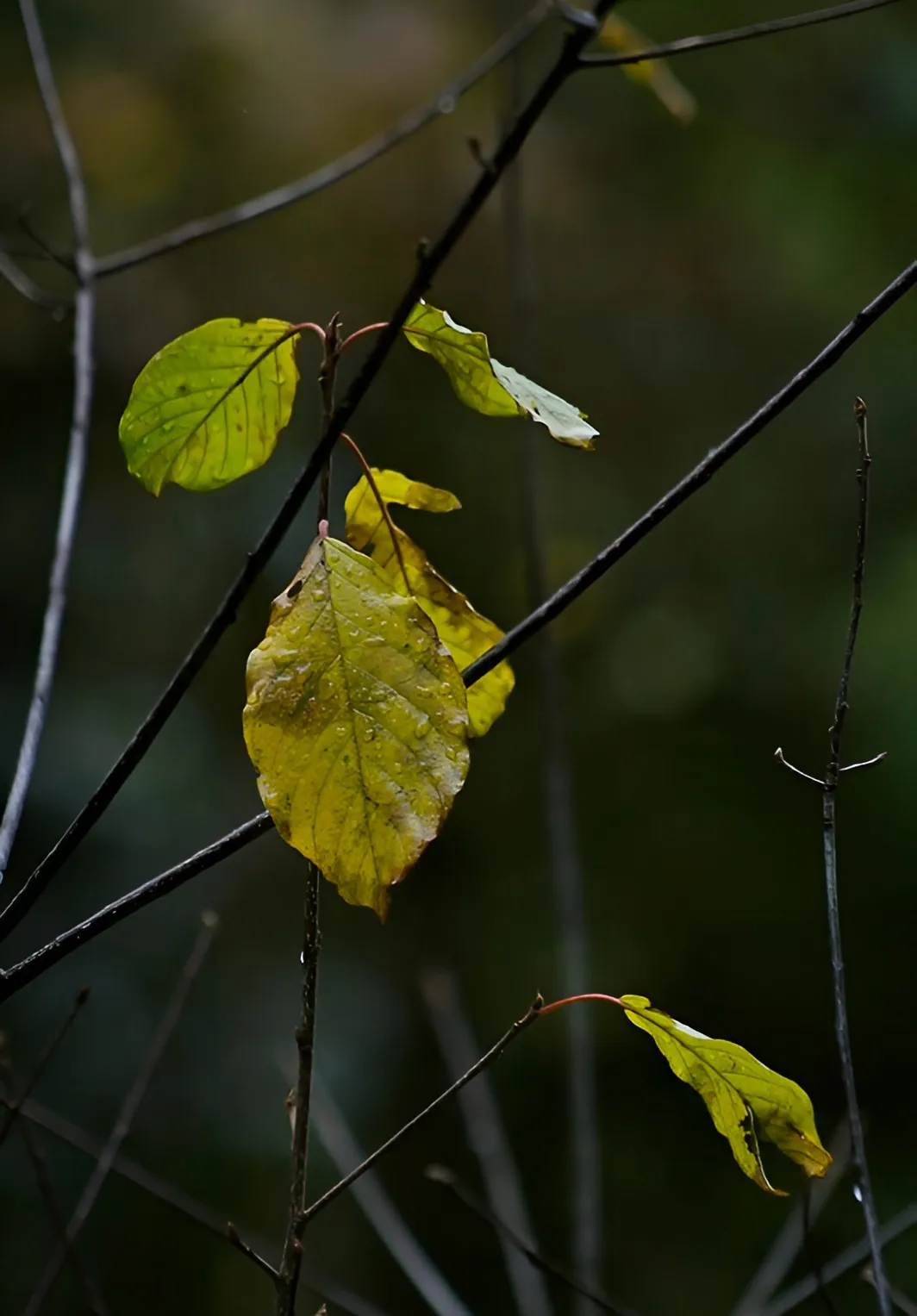
    November

    Canon Digital Rebel XTi – Tv mode – Manual

    After experimenting with various settings, I settled on Tv for more control over exposure and set the focus to Manual. The shadows had deepened and the colors were bordering on surreal but when I brought them into Photoshop, the images seemed drab and lifeless compared to what they had been in reality. I didn’t want to increase the saturation and risk blow-out in any of the channels – my days of increasing saturation were over shortly after I discovered that everything did not have to look like it had been shot in the Amazon jungle. I have old photos processed in my early Photoshop days that now belong to a category called “What was I thinking?”

    Bringing back what we saw in the first place

    To bring back a sense of what I had seen along the forest trail, working in the ProPhoto color space, I converted the images to LAB mode and gently steepened the curve in the A and B channels, leaving the Lightness channel alone. I reduced the effect about 50% and switched back to RGB for a little sharpening using the High Pass filter before converting to sRGB IEC61966 and reducing the size for web. The final result is much closer to what prompted me to take the photo in the first place!

    Writer’s note: For me, November has always been a time when all things are possible. The world shifts in smoke and mist and musings can be rather melancholy. Light changes rapidly, leaving memories behind on the shore. It is the time of year I re-read books by Thomas Hardy. My love affair with November began with a novel I read as a girl. It was from the more innocent years of the early ’60s and was called Then Came November. There is the movie, Sweet November, that stayed with me for years. No, not the bad remake but the original from 1968 with Sandy Dennis and Anthony Newley. Nothing stands still in November — hold each moment. Capture the thought for it is extraordinary!

    Canon Digital Rebel XTi – Tv mode – Manual
  • Low Light Interior

    > >

    Patterns

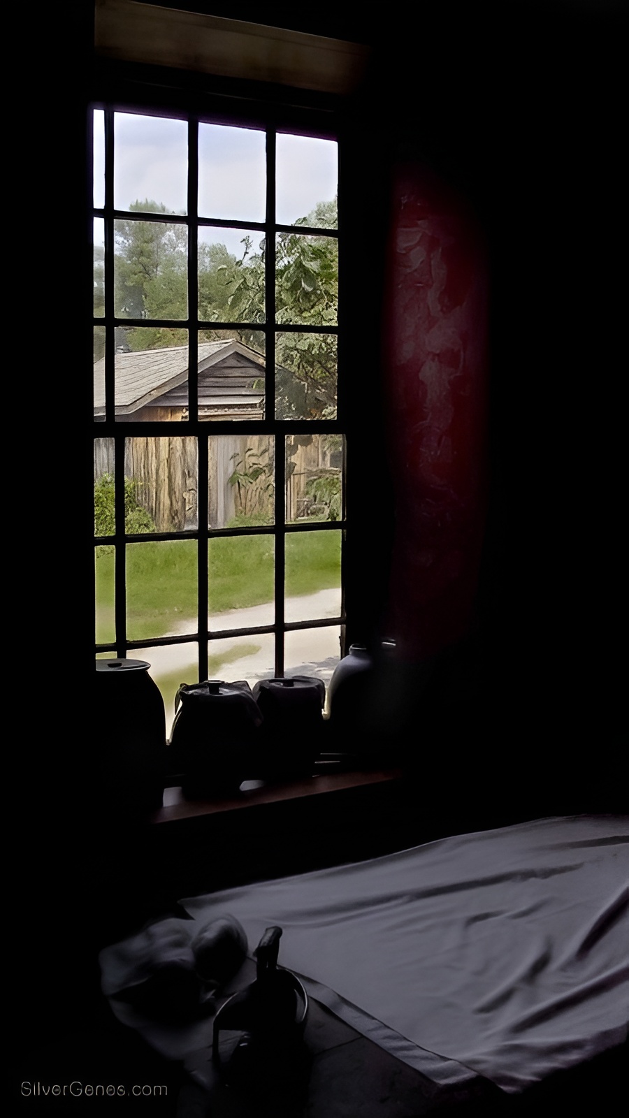
    These are my first digital photos taken with a Sigma SD9 way back in 2001. It was at Upper Canada Village in Morrisburg, Ontario on a bright summer afternoon.

    This is less than optimum for interior shots with a window as a backdrop. Because there was an expanse of white fabric in the foreground, exposure was lowered to capture more detail outside. Same problem though in low light situations – noise present in the foreground. Again, minimal adjustments here. Shadow Highlight with masking brought out detail in the curtain on the right side of the window but once again, Levels had to be adjusted to avoid confusion in the shadow zones.

    Lesson learned:

    It’s much better to slightly overexpose than underexpose. The math of digital photography maintains more information at the light end and allows more detail to be recorded and rescued when needed.

    Writer’s note: 

    By now it’s probably apparent that I have a ‘thing’ for windows and doors. For me they represent portals to the past, to the future, and to the unknown.

    There is a feeling that I try to capture in some of these impossible shots and even though it may be technically challenging, the underlying emotional response is still there.

    Can I still smell the linens as they were being pressed? Can I imagine the summer activities outside as I sprinkle more lavender water over the sheets?

    Yes! The same holds true for my writing notes as for the photo.

    Pay attention to the foreground when near time portals!

    Sigma SD9 – ISO 400+
  • Shadowlands

    > >

    Washed Light

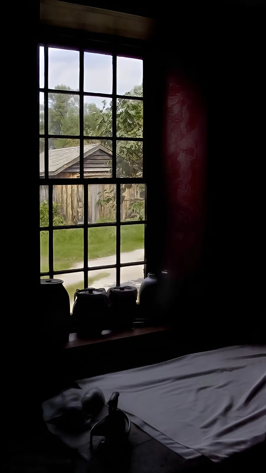
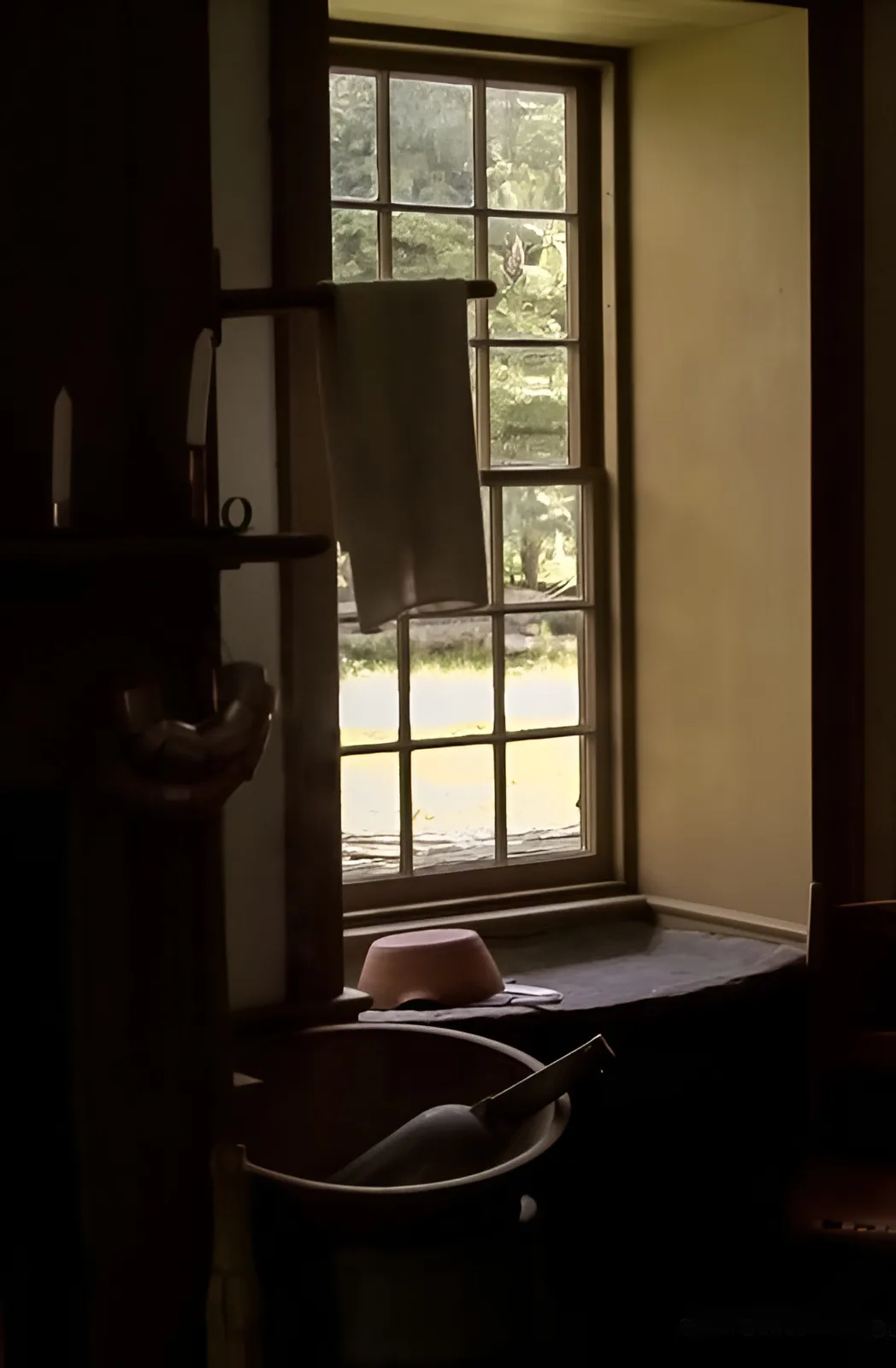
    This photo was taken at Upper Canada Village about 25 years ago with a Sigma SD9. It was shot in RAW and adjusted in Aperture and Photoshop.

    I still miss Aperture.

    This is what should be an impossible shot but I was going for the mood of deep shadow in the interior. Unfortunately, there is a great deal of noise in the low light areas so I made some minimal adjustments to these areas.

    It was taken at midday during the summer so the light is very harsh, intensifying the contrast. There is blowout in the road outside and flare that I removed from the metal hanging by the window. Still, there was something about the mood of the shot that made me want to keep it.

    Levels adjustments were used to unify the shadow zones and I adjusted the RAW image for deep shade to capture the colours more accurately. Finally, a noise filter was applied to reduce the colour noise in the green and blue channels. If I were doing this again, I would make multiple exposures at the time of capture.

    Writer’s note: I love going to places where it feels as if I’ve stepped back in time. I’m keenly aware of the heat, the buzz of summer insects, the sound of everyday activities.

    Wait.

    Horses hooves and distant oxen are not exactly everyday noises. The scents and colors are different, too. Colors of milk paint and dyed wool have a depth and feeling of permanence that is hard to describe. Take the shot. Pull in as much as you can for reference. Can you feel the meaning and purpose of things? This is how it used to be every day. Remember and use it for your historical novels.

    Sigma SD9 – ISO 400+
  • Dandelion

    > >

    Lion’s Tooth

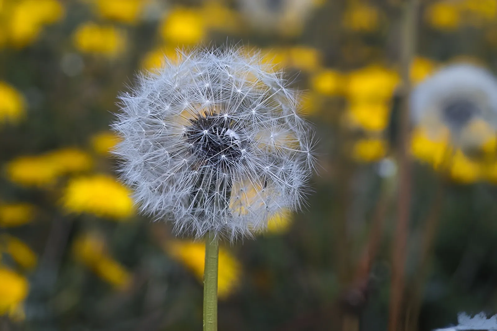
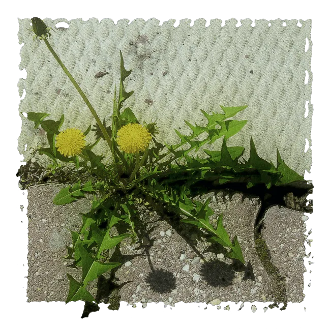
    Ah, the dandelion. This is one of nature’s most useful plants. Every year we do our best to eradicate it and it bounces right back! In this case, it grew between the cracks of some highly textured concrete.

    This shot was taken with a Canon Rebel XTi and basic adjustments in Aperture – now I would use Affinity.

    The effect of light and shadow is harsh because it was taken in very bright sunlight. It was so high contrast that it seemed as if it had been over-processed and the contrast boosted. Even the colour appeared too saturated. This is a great example of when not to shoot. Either that, or be prepared to do something creative with it in editing. I had fun making this ‘old Polaroid type’ transfer.

    Writer’s note: Do you have anything stashed away that makes you wince but you can’t bear to throw it out? Give it new life, just like this. Do something different with it. Take phrases and make greeting cards, or word puzzles. Have fun with bad writing! If anyone is fresh out of that, I have a stash I’m happy to share!